Monday, 18 January 2010


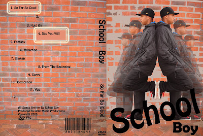
Here i added the barcode to the Cover. Trying to put a barcode on it was quite hard at first however we then found a font on 'www.dafont.com' this made making a barcode really easy.

Here i added the name of the artist and alvum onto the spine of the cover. I also added the production details. We had to find a real record label for our artist, different to teh one of teh artist who made our song; so i had to research other hip hip record labels. I found 'Renn Music Productions'

This is my first attempt of the Front Cover of my DVD. Here i was experimenting with where i wanted the writing to be and where it would work best.

This is the inside of my DVD Cover finished. I think this went well as it relates to my genre through using a brick wall. I also like the way the wall looks after i used the fill tool on it to fill in some of the bricks, i think this looks quite interesting and catches your eye.

This is the first attempt of the inside of my DVD Cover. I made the spine of the cover a different colour so i was able to work with it easier than if i was to guess where it would be.

This is another tester for the front cover for my ancillary task. Compared to the previous image, i have taken the image of the artist away. i have also added the name of my band to the bottom of the cover.

This is a tester for the front cover for my ancillary task. I used photoshop to change the opacity of the images as they went further back this was to bring more attention to the image right at the front. I also used the fill tool to fill in some of the bricks to add to the effect.


This is a tester using the fill tool on photoshop. I used a grey colour and filled in some of the bricks on the wall. I think this was effective as it fits in with out genre. It also makes you concentrate in the artist more and this is what i wanted to achieve. Editing the image was effective as it made it more interesting to look at rather than just having the artist standing up against a wall.


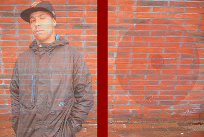
This is the photo i used for the inside of my DVD Cover. I chose to take a closer picture this time instead of sticking to one distance.
The second image is from where i had to use photoshop to cut out the background to paste it in front of a brick wall.


These are the four photos i took for my front cover of my ancillary tasks. I chose for him to wear these clothes because it fit in with our genre. However i think it would have been more effective if he had worn jeans and a hoodie instead.

This is the picture of the brick wall i used in all of my ancillary tasks.

Monday, 11 January 2010

In todays lesson i carried on with my ancillary tasks. My front and back cover of my DVD case are now basically complete. All i really have left to do is add in a couple of comments from magazines onto my poster.